- Our Story
- Our Impact
-
Our Projects

Residential
Commercial

- Careers
 Enquire
 Call
Call
 chat
chat
 Search
From Calm to Bold: The Emotional Blueprint of Colour in Interiors
By Design Pataki
February 13, 2025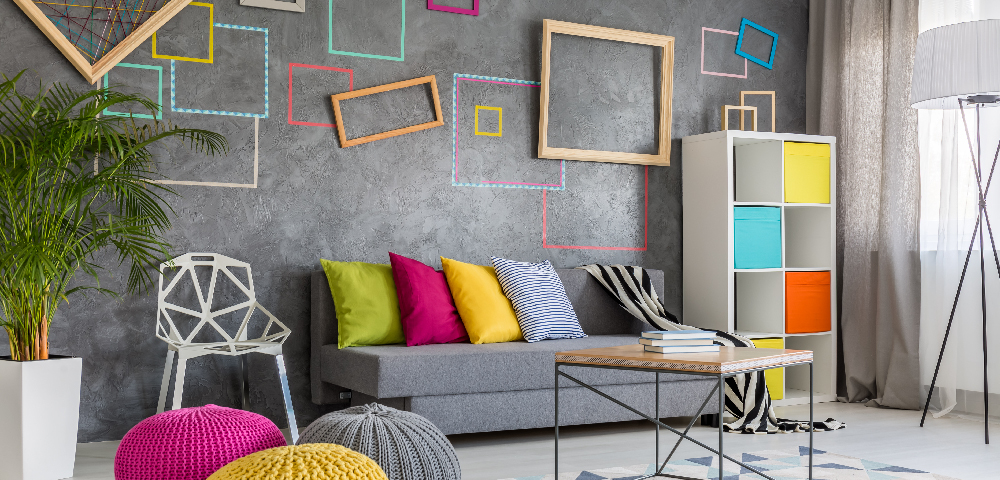
Colour isn’t merely an aesthetic choice–it plays a pivotal role in shaping our perceptions, moods and experiences. As a homeowner, understanding home colour schemes and the psychology behind them helps craft an environment with intention so that it can resonate more deeply. This means you can live in a home that’s a complete extension of you – a serene bedroom retreat or a living room full of character and energy. Here is all you need to know to unlock the potential of colour psychology in your home decor.
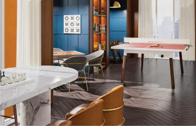
Vibrant Hues Energise Your Space
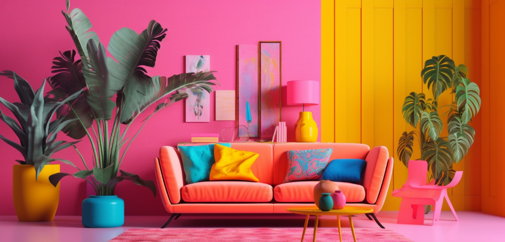
Vibrant hues have the power to transform the home interior design, infusing it with energy, character, and vitality. Whether it’s the refreshing duo of electric blue and lime green to evoke a sense of focus in home offices and kitchens or the cheerful pairing of fuchsia pink and sunny yellow to spark creativity in social areas, bold colours can redefine interiors. If you’re not a fan of using vibrant hues on walls, try incorporating them through accents like cushions, rugs, wall art, or statement furniture pieces. These lively touches enhance the mood while bringing a dynamic visual appeal, striking the perfect balance between playfulness and sophistication.
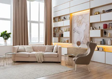
Neutrals & Earth Tones Keep You Grounded
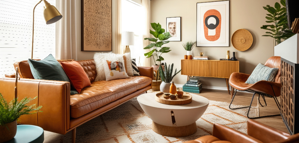
Neutrals and earth tones like beige, taupe, warm greys, and terracotta evoke a sense of stability, warmth, and comfort in home decor. In colour psychology, these hues are linked to feelings of grounding and connectedness. Earthy interior design colour schemes remind us of nature, encouraging relaxation and a sense of balance, while neutrals offer timeless elegance. When used in interiors, these shades are a calming refuge from the hustle of daily life.
White Evokes Serenity and Calm
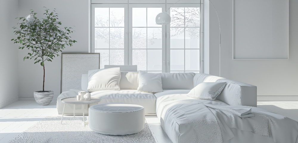
White is a timeless choice for minimalist homes that aim to feel expansive and airy. In colour psychology, white is associated with purity, clarity of vision and openness. To enhance the openness, consider layering and playing with different shades of white. For instance, crisp white paint schemes for houses, soft ivory furnishings, and creamy white textiles can harmonise to create serene retreats where simplicity and relaxation prevail, allowing natural light to flow freely and other home interior design elements to stand out truly.
Jewel Tones and Metallics Make a Space Richer
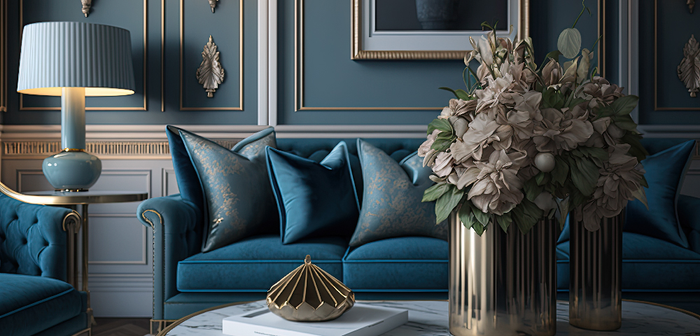
Opt for richer, darker shades like burgundy, emerald green, navy blue, and plum for a touch of luxury. These interior decorating colour schemes are often associated with wealth and opulence making them ideal for creating timeless home decor. Burgundy, with its associations of elegance and refinement, is an excellent choice for dining rooms or libraries where a touch of formality is desired. Deep emerald green invokes feelings of nature but with a luxurious twist,making it ideal for lounges. Navy blue, synonymous with stability and authority, brings a sense of depth and calmness to living rooms or home offices. Additionally, pairing these hues with metallic accents like gold, brass, or bronze can amplify this sense of richness, drama, and allure.
Soft Pastels add Playfulness and Childlike Wonder
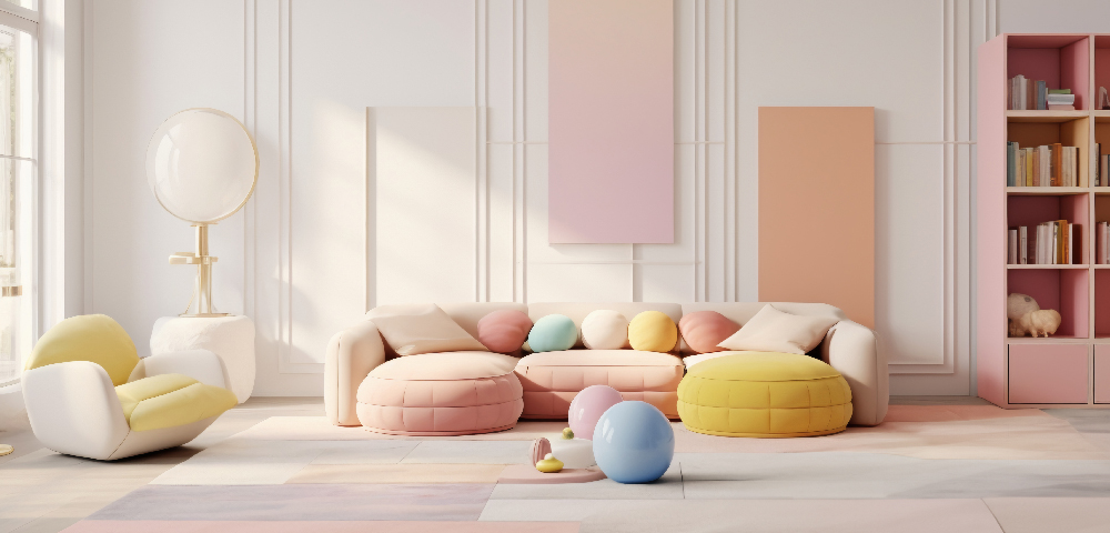
Pastel colours such as blush pink, lavender, powder blue, sunshine yellow, and mint green bring a sense of lightness, charm, and subtle joy to a space. These gentle home interior colour schemes create a sense of whimsy, making them ideal for nurseries, reading nooks, or any room where you want to foster comfort and imagination. When layered with natural textures like rattan, linen, or light wood, pastels help foster an environment that feels nostalgic, light-hearted, and pleasing to the eye.
Using colours in home interior design strategically can elevate a room from merely functional to deeply immersive, shaping our experiences and memories within those spaces. When we understand the emotional impact of different home colour schemes, our spaces feel more in tune with our core personality. This is the true power of colour psychology: it transforms interior design into a medium for connection, self-expression and living with intention.
A series with Design Pataki
You may also like
 Design & Architecture
 Design & Architecture
 Design & Architecture
Recent Blogs
 Sustainability
Accelerator Dialogues | Advancing Ambition: Breakthrough Technologies…
By Zoya Zakai, Sai Sri Harsha Pallerlamudi -RMI India Foundation, Aun Abdullah - Lodha
Read More Sustainability
Insight Brief: Net Zero by Design - Material Minimalism First,…
By Dr. Prasad Marepalli, Aun Abdullah - Lodha
Read More Sustainability
Insight Brief: Creating and Sustaining Market for Limestone Calcined…
By Sai Sri Harsha Pallerlamudi, Tarun Garg - RMI India Foundation, Aun Abdullah - Lodha, Dr. Shashank Bishnoi - IIT-Delhi
Read More